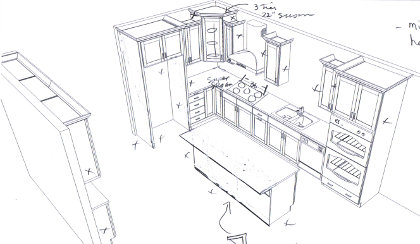
 This is the second pass at the kitchen design. After Mark P. sent it over we talked about it four a half an hour or so. This and the previous design were good efforts to allow us to start the conversation, but there will be some pretty big changes from what is in this image. We think we might put in a dogleg shaped island and move the sink and the dishwasher from the wall over to the island. The reason for the dogleg is to be able to put the sink in a place where it is possible to see into the living area and out the window. Mark said, and we concur, the view from the sink is very important because so much time is spent there.
The island and what is in it is the major change, but here are quite a few other little changes we think will make the kitchen more usable. One of the main features of the new design is the movement of the sink made the appliances and counter space much less cramped on the wall where the stove will be. It also made more space to the right of the kitchen for the dining area. We plan to have a vegetable sink installed beside the refrigerator and, on the left wall (in this drawing), there will be a small counter that protrudes further out than the narrow cabinets we can use for coffee/tea service.

Leave a Reply