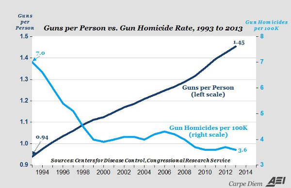
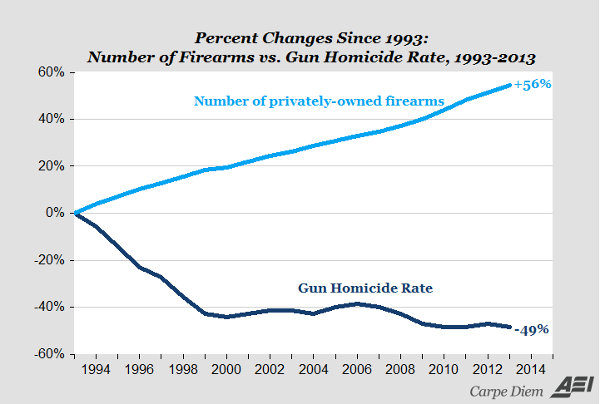
In the aftermath of some very sad violence, I found the following graphs from an article at the American Enterprise Institute title Chart of the day: More guns, less gun violence: between 1993 and 2013. The graphs are very explanatory and the article puts it in context.


Leave a Reply